Categories
Web Design

What is a WordPress theme in 2020?

When I used WordPress in the past, I always wrote custom themes. To me, the default themes always felt very rigid and uninspired. But after taking a look at the latest release, I’m finally happy to use the default theme on my personal site. Here’s why.

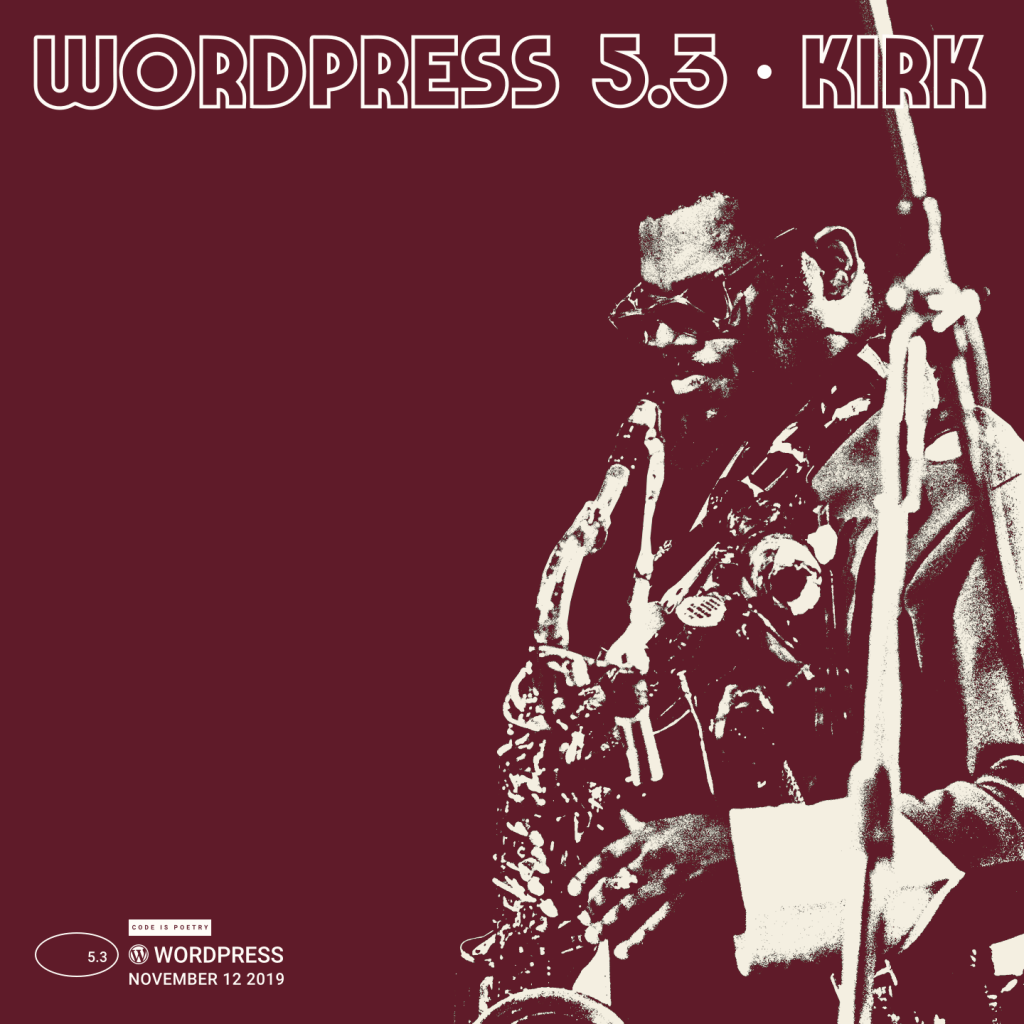
WordPress recently released version 5.3 “Kirk” with the new Twenty Twenty theme. Another boring WordPress core update with another boring yearly theme, right?

Not this time!

First, this is the first core theme that feels like it was actually built with the recently introduced WordPress Block Editor in mind.

Instead of providing a collection of static templates, Twenty Twenty embraces the modular approach with a simple design that enhances block content without getting in the way. The result is a design flexibility that was previously not possible.

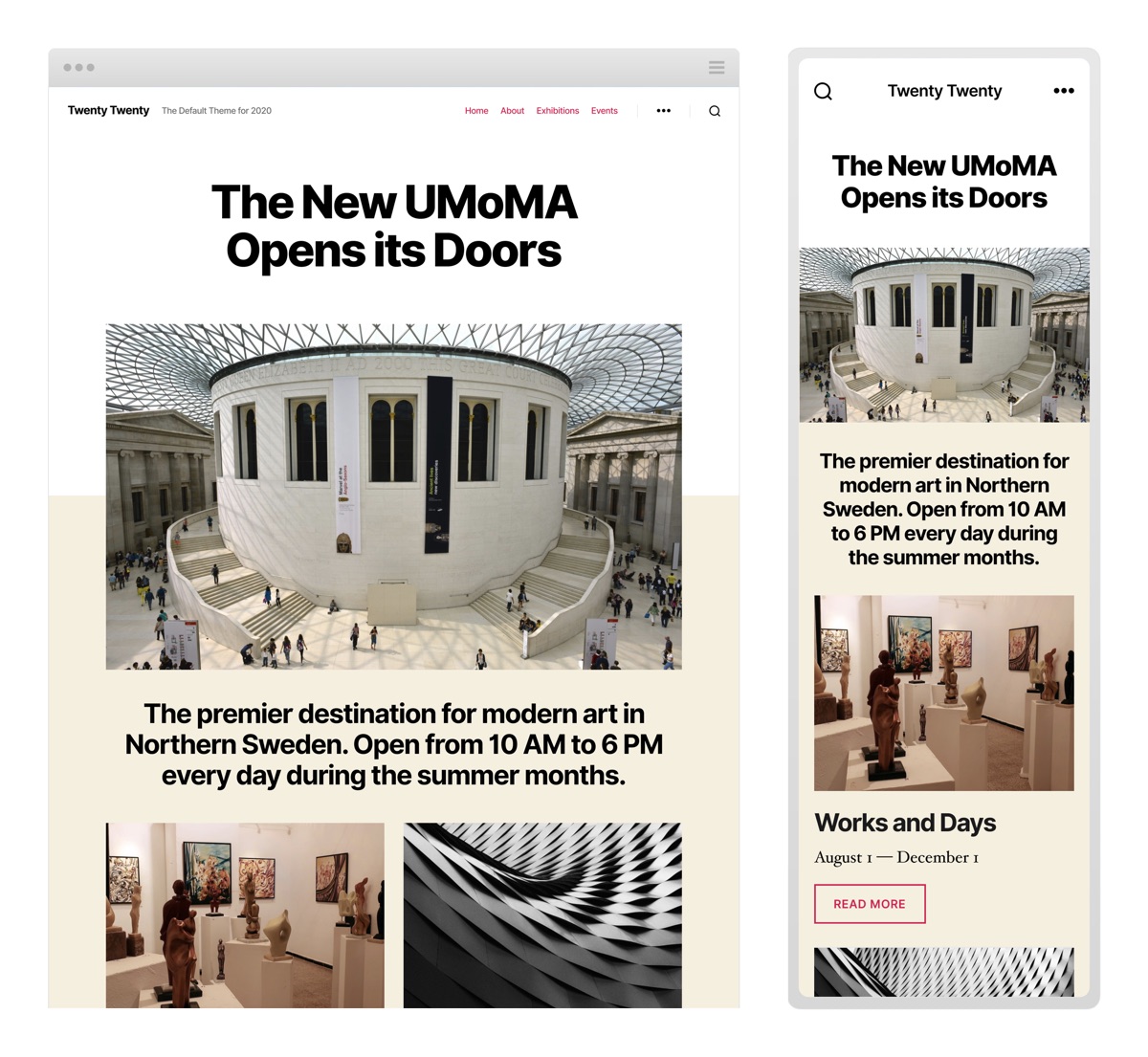
Twenty Twenty is actually based on Chaplin, a free theme by Anders Norén who was also the design lead on Twenty Twenty.

He seems to have taken the right approach to building a default theme, and understands how to make structural design choices while still leaving a lot of room for design flexibility.

“The responsibility of a theme is to empower users to create their inspired vision by making the end result look as good, and work as well, as the user intended.”

Anders Norén

New theme, new font

Twenty Twenty also uses a brand new typeface called Inter, designed by Rasmus Andersson.

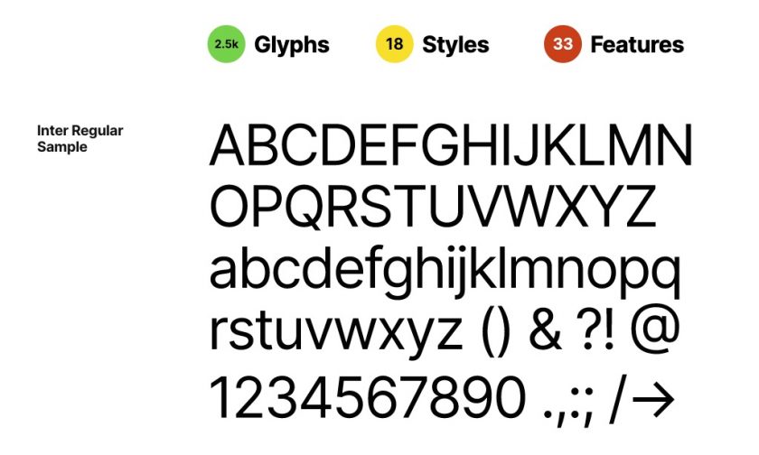
It’s a modern font family designed for sharpness and readability on screens of all sizes. It’s also optimized for minimal request overhead.

A modern font goes a long way to make all elements of the modular design looking sharp and consistent.

It’s good

All this to say, I think Twenty Twenty is a huge win for anyone still hosting their own blog or personal site.

There’s about a million ways to ‘build a website’ in 2020. But for my money, a self-hosted WordPress CMS is still one of the easiest ways to truly own your content without sacrificing modern CMS features and template design.

Categories
Web Design

A new website for the New Year

2011 was a very interesting year for the web. The App Internet continues to march on while web consumption continues to fragment into a myriad of devices with different browsers and form factors.

Out with the old

As Jeffrey Zeldman recently pointed out, the days of a single fixed width layout are over and web designers once again find themselves in uncharted territory with few standards to guide them. What is the new ‘best practice’ in web design? Responsive design? Adaptive? A return to fluid layouts?

It’s easy to complain about the lack of guidelines and the seemingly daunting task of crafting a great user experience across so many devices. It’s a lot more fun to start experimenting in search of a solution.

It was with that spirit I set out to redesign my personal site a few months ago. I wanted to create a proof of concept for a mobile-first, adaptive design where every page looked great no matter what device you happened to be using.

Simplicity

My first goal was to keep things as simple and lightweight as possible. Mobile-first design treats mobile and desktop as equals, so pages had to be small enough to load quickly, even at 3G speeds. Frills were cut, and a minimalist style was adopted.

Hot tools

I looked at many responsive and adaptive grid systems before settling on Joni Korpi’s excellent Frameless. The Frameless grid frees you of pixel-based thinking by using LESS to calculate em based columns that give you more control over which elements adapt and which do not.

FitVids, a jquery plugin for adaptive video players, works flawlessly for scaling videos.

Results

I’m very happy with the results of this first step into full-scale adaptive design.

The site adapts well to every smartphone, tablet, and desktop display out there, while remaining very lightweight. Grab the corner of your browser and resize away. The content will scale to fit any size.

The future

So, what’s next for the web?

Will standards start to emerge? Will the app internet make the web irrelevant?

Who can say. As always, the only consistence is change. I’ll just continue to have fun navigating it.

Categories
Web Design

Site redesign

I’ve been working on a new site design for the last couple months, and now it’s live.

Aesthetically, I was going for a look with bold typography, clear separation of content, and simple, easy to navigate layout.  I mixed a tech theme (circuit board and sharp edges) with an arts & crafts feel (large type and cut-out borders) to reflect my work as a web developer, and my interest in all things creative.  I decided on a green color scheme to stand out from the typical blog, and because I’m a fan of Kermit the Frog.  Emphasis is still on the content, but I think the new theme gives the site the extra flavor I was looking for.

I’ll be using this personal blog to post quick thoughts, cool videos and links, and the occasional music or film review.  Enjoy!